
Custom Combination Chart PowerPoint Template
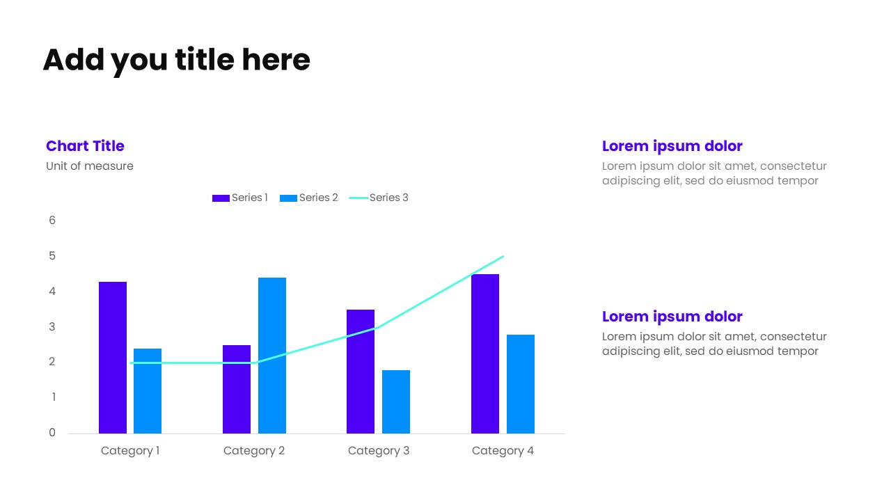
This slide features a custom combination chart on the left, integrating multiple chart types—such as bars and lines—into a single visual to present layered data and complex relationships clearly. On the right, a structured text area with a strong header and supporting subtext allows you to explain key insights, correlations, and performance highlights derived from the chart.Ideal for trend analysis, performance tracking, target vs. actual comparisons, and multi-metric reporting, this layout brings clarity to complex datasets. The balanced left–right structure ensures the data remains visually engaging while the supporting text provides meaningful context, making it perfect for executive presentations, business dashboards, and data-driven storytelling.
No Reviews and Rating
-
 Ready-made slides
-
Easy to customize
-
For personal & business