Enjoy Premium Plans at
Signup
~50% OFF

Stacked Column Chart PowerPoint Template - S1108
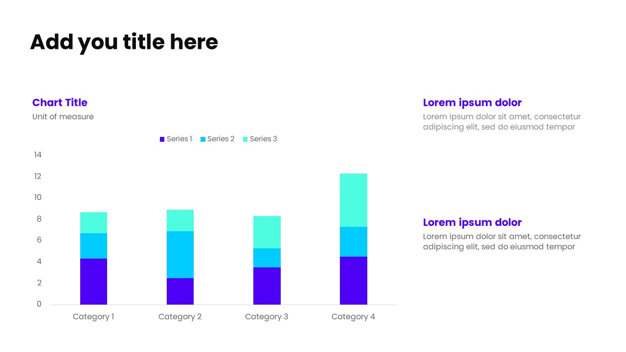
Show relationships and composition within data using this PowerPoint stacked column chart template, featuring the chart on the left for clear visual comparison across categories. A supporting header with unit of measure provides instant clarity, while the right-hand panel includes multiple headers with concise sub-text to highlight patterns, contributions, and key insights.Ideal for performance breakdowns, category analysis, financial reporting, and executive dashboards, this layout combines strong data visualization with explanatory context—helping audiences understand both totals and individual segments. Fully editable and designed for professional, data-driven presentations.
No reviews and ratings yet.
-
 Ready-made slides
-
Easy to customize
-
For personal & business